RSS

Category Archives: Photograph persistence

Ideas and issues around keeping photos (especially digital photos) from ceasing to exist by virtue of lack of backups, failure to document, loss of old file format readers, etc.

Photographer reputation: our immediate jewel

Si02_two_ways_small

SiO2 two ways – 2016

Photographs with gravitas

Can you call to mind any photographs you’ve seen recently that you think stand out from the rest? That are worthy of retaining in your precious and limited mind-space? That have a place in the story of your life, your family, or your community? Perhaps even in our global human story?

Unlike the others whose provenance and prospects are of no more than momentary interest, these few note-worthy  images arouse more than a momentary pique of curiosity, and somehow inherently seem to matter.  What they represent is important. How they came to be is important. Who created them is important. How they can be used is important. Somehow, they just seem to have gravitas.

For these sterling images, we widen our field of vision and consider more than just the meaning and aesthetics being communicated by the image. Depending on our experience and perspective we might consider some or all of many things: provenance, photographer, context, resolution, identity of subjects, and more. What constitutes ‘an important photograph’ is not the same for everyone.

An environmentalist might want to preserve an image because it appears to capture a rare event of black swans flocking in enormous numbers on the New South Wales south coast but she might wonder if the swan numbers were artificially inflated by image cloning (they weren’t).

60BlackSwans_IMG_0358_small

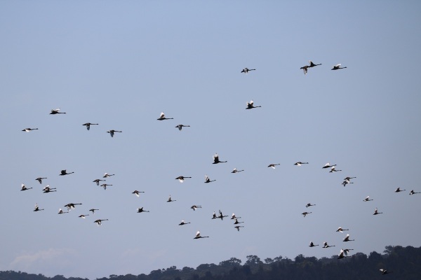
60 Black Swans – Coila Lake, New South Wales Australia – 2015

Parents might love a particular photo of their children and want to know where the photo was taken.

JPG_SMALLSIZE_DSC07642_19May2012_Harry_and_Obi

What *he* said –  Harry and Obi Ward – Nisi’s, Cootamundra,  2012

Conservators might be especially interested in the date of the photograph.

ChristchurchCathedral_small_DSC04500

Christchurch Cathedral entrance prior to the 2011 earthquake – Sept 2009

In all of these cases, the person standing behind the photograph, the photographer, is indispensable.  She or he is needed to tell the story of the photograph – what it depicts, when it was taken, what has been done to it.  The credibility of the photographer reflects on the credibility of the photo.

Our photographic reputation

So what about when we are the photographer? As a photographer, we are not judging photographs, we are judged by our photographs. We stand behind them. We have a role to play in acting as a witness not just to the event we photographed, but to the meaning and context of the photograph itself.

Just like any witness, we may be able to rest on our solid reputation such that even unusual photographs will be believed because we are believed.  Or we may be unable to convince anyone that we haven’t manipulated an image because we have a reputation for producing images that are more art than true representations of the world around us. Like any other walk of life, our reputation precedes us.

goodnamequote

Living in the digital age has both opportunities and challenges.  As photographers, the best of our work can be preserved for as long as there is interest in what we accomplished.  Unfortunately, so can the worst of our work.  From simple sins of omission that leave our photos orphaned because they cannot be understood without context, through to sins of commission like deliberately misleading photo editing, or acts of inappropriate image publication, our worst photographic choices will forever cast a shadow over our best.

And our work can last for a very, very long time. For example, my post “Keep ’em Flying” about  a photo of 9 WWII era matchbooks illustrating the early days of pilot training is a perennial favourite despite the events of the story and the matchbook covers being over 70 years old.

Newport

Detail of 1940s matchbook cover

By the same token, Henry Peach Robinson’s “Fading Away,” has lingered for over 150 years, and, while a poignant illustration of human frailty, is also a image with no representational truth, being created with staged actors and 5 different negatives. It is photographic art, but not a photograph. It is difficult to know which, if any, of Robinson’s ‘photographs’ are real, and which are fabrications. In the 1860s photography was relatively poorly understood, so it may not be that Robinson’s reputation preceded him, but it certainly succeeded him.

512px-Fading_Away

Henry Peach Robinson’s Fading Away, 1860

No one is perfect, but I believe it behooves us to act as honourably as possible in our photographic practices, not just because it is the right thing to do, which should be enough, but in enlightened self-interest. If we care enough to take photographs, we probably care enough to want them to endure.  The photographical canon of the future is likely to be an amalgam of the many useful photographs taken by photographers with integrity and character, and the relatively fewer infamous ‘doctored’ photographs that serve as a warning of what not to do.  Everything in between, the dubious, the unknown, the incomprehensible, the orphaned photographs may well just be visual noise, given short shrift by our descendants.

The great difficulty is first to win a reputation; the next to keep it while you live; and the next to preserve it after you die, when affection and interest are over, and nothing but sterling excellence can preserve your name. Never suffer youth to be an excuse for inadequacy, nor age and fame to be an excuse for indolence.

– Benjamin Haydon (1786-1846)

Photographs
———–
60 Black Swans, What *he* said,  and Christchurch Cathedral entrance prior to the 2011 earthquake, photos by Sabrina Caldwell, other than resizing for web use, no alterations have been made
Detail of 1940s matchbook cover, photo by Brian Bleecker, image cropped and resized for web use by Sabrina Caldwell
Fading Away by Henry Peach Robinson, public domain
SiO2 two ways, photos by Sabrina Caldwell, image was cropped and resized for web use


Tags: , , , , , , , , , , , , ,

A honey sun

honeysun2

Total eclipse of the sun showing Baily’s Beads, solar flares and the sun’s corona (1860) by Warren de la Rue. [1]

This is an image I have been admiring for months now.  I admire it because in just the smallest amount of detail and delicious colour – a sphere of dark amber, sparkling at the edges, in a background field of honey gold – the photograph is serenely ablaze with a vast wealth of knowledge that spans many disciplines: science, invention, travel, astronomy, art, adventure, history, chemistry and photography. And to it we can now add printing, computer science, imaging, and social media. It is the very definition of succinct.

And this is its story.

Warren de la Rue and Father Secchi

Until the arrival of early afternoon, Wednesday of July 18th in 1860 was like any other weekday in Spain. As was the custom, the hot sun had driven Spaniards into their cool homes for siestas. But for Warren de la Rue, the midday sun was a ticking clock, counting down to the 2:36 pm endpoint to which his previous several days had been in aid of, when the Earth’s moon would slip across the face of the sun and obscure it in a rare total eclipse. He had traveled many miles from London to Rivabellosa near Miranda de Ebro in the North of Spain, complete with assistants and 2 tonnes of equipment: his newly designed photoheliograph camera, photographic lab with solutions and glass plates, drapes and lamps, [2] (and perhaps his comestibles[3]).

At the same time, Father Angelo Secchi, an Italian astronomer and Jesuit, was arranging his own telescope and camera to photograph the eclipse, 500 kilometers away in Desierto de las Palmas, a small town 2500 feet above sea level recommended by the the Spanish Anuario as a choice location for viewing. (Perhaps the prospect was further facilitated by the presence of a convent in the area offering accomodation and the mere 2 mile trek from the high road.) [2 p34]

“Above all, Father Secchi believed A caeli conspectu ad Deum via brevis ( Contemplation of the heavens is a short way to God. )” [6]

Secchi and de la Rue were in place to use the eclipse of 1860 to photographically capture the halo reported by observers of previous solar eclipses, and to solve a mystery: the nature and source of ‘Baily’s beads.’

Baily’s beads

“…a row of lucid points, like a string of bright beads.”

Baily’s beads were first noted by their namesake, British astronomer Francis Baily, during the 1836 annular solar eclipse. Baily was amazed to see tiny beads of light in the glowing outline of the sun behind the moon. These beads of light became known as Baily’s beads, and were the subject of intense speculation for the next quarter century. Although there were many observers of the next eclipse, reports were inconclusive, and in 1860 the perfect confluence of a total solar eclipse plus the photographic expertise to record what might be revealed allowed the true nature of Baily’s beads to be known.

The expeditions were illuminating.  Warren de la Rue captured stunning images with his heliograph camera including one of the total eclipse. The images captured proof of the beads Baily described, and together with Father Secchi’s images, confirmed Baily’s conjecture that the beads of light were caused by the sun’s light streaming through the irregularities of the moon’s edges, varied from complete roundness by mountains, valleys and craters. But the photographs didn’t show just the beads.They also showed the solar corona, a halo of sunlight around the darker moon that Baily had eloquenly described:

“…I was astounded by a tremendous burst of applause from the streets below, and at the same moment was electrified at the sight of one of the most brilliant and splendid phenomena that can well be imagined. For, at that instant the dark body of the moon was suddenly surrounded with a corona, or kind of bright glory, similar in shape and relative magnitude to that which painters draw round the heads of saints.” [4]

Solar flares burst into prominence

Secchi and de la Rue’s photographs showed us something else that had never before been recognised: strings and splashes of light matter streaming out from the sun’s surface. Through these photographs, only 156 short years ago, we first learned the sun sent out solar flares.  An important consequence of Secchi and de la Rue taking photographs so far apart from one another was that they could prove that the corona was a solar phenomenon and not a lunar one, because the features of the corona were identical despite the 500 kilometer separation of the two astronomers which would have meant differences in the images from the differing angles were the phenomenon to be lunar.

And now to the honey gold: lingering sulfides and age

You may know that the collodion photographs of the mid 19th century were achieved through the use of photo-sensitive qualities of silver, just as black & white film was in the 20th century. So how did this photograph, which must have been black with white flares when taken, become the golden-hued beauty it is today?

At first, I had thought someone had performed some global colour changes on photograph prior to printing it. But in recent months I have learned more about the chemistry of 19th century photography, and discovered it is more likely that the golden colour of the image is the result of a happy error.

solar_eclipse_warren

B&W version of total solar eclipse, (1860) Rivabellosa, Spain.  Photo: Warren de la Rue [6]

The culprit is probably excess sulphur remaining on the print after insufficient washing of the print.  Fixing baths for collodion images were made with hyposulphite.  If any of the hyposulfite remains on the print after washing, the sulphur can fade black and white images to shades of gold and brown. In many cases this would be a pity; in this case it has created a thing of beauty. [5]

Within this photograph, below its surface, powerful forces are at work: the attraction of electrons from one molecule within an emulsion to another over long stretches of historic time, the mystery of a boiling sun incessantly compressing hydrogen into helium to warm our planet throughout geologic time, and the torch of knowledge held out to us by de la Rue and Secchi, to carry forward towards the unknown future.

This photograph is the celestial embodiment of lovely words by modern poet-philosopher Anthony Liccione:


Her complexity is a glorious fire that consumes, while her simplicity goes unapproachable. But if one takes time to understand her, there is something beautiful to find, something simple to be loved.


honeysun_without_text

And so we come to the end of this brief consideration of an image that is a simplicity itself, but through the avenues of printing, computer science and social media speaks to us of science, invention, travel, astronomy, art, adventure, history, chemistry, and photography.       How poetic.


References

——————-

[1] This photograph is to be found in the book The Invention of Photography: The First Fifty Years (pp82-3), and is in the possession of the Royal Astronomical Society, London.  Public domain. Please note: I have been trying to work out the writing at the bottom; so far I have “2nd of totality shows the  ____ _____ after the ____, _____ had been ________. Not very enlightening.  If you know, please let me know!
[2] Charles Vignoles (1860). Observations to accompany the Map of the Shadow-path thrown by the Total Eclipse of the Sun on the 18th July, 1860, across the North-Eastern Part of Spain. London: Longman, Green, Longmans and Roberts.  p. 37
[2] There is a great photograph of Warren de la Rue and his team on Getty images.
[3] In 1860 there weren’t fast food restaurants on every corner: “…the traveller will do well to provide himself, before he leaves his hostelry in the morning, with some of the “provend” so much insisted upon by that experienced traveller in Spain; and the Englishman should take care not only to carry his tea, but his tea-pot and tea-kettle. Even at the best places people have to wait a terribly long time for their meals, unless ordered some hours beforehand.”[Vignoles p37]
[4] Littmann, Espenak and Wlcok (2008) Totality: Eclipses of the Sun. Oxford Press pp 71-2
[5] T. Frederick Hardwich (1861). A manual of photographic chemistry, including the practice of the collodion process. London: John Churchill, New Burlington Street.
[4] Used via copyright provisions of Encyclopedia Brittanica, https://www.britannica.com/media/full/153681/141531
[6] Giorgio Abetti. (1960)  Father Angelo Secchi: A Noble Pioneer in Astrophysics. Osservatorio di Arcetri. http://articles.adsabs.harvard.edu/cgi-bin/nph-iarticle_query?1960ASPL….8..135A&defaultprint=YES&filetype=.pdf
 

Tags: , , , , , , , ,

Pestilent error and ‘The legitimacy of skies in photographs’

I am apparently in pestilent error. Worse yet, according to Henry Peach Robinson, I may be having “a detrimental effect on the unthinking.”  It appears I am a lingering member of a school of critics that for Robinson, was in 1869 “now, happily, nearly extinct.” While I would not say that I “teach that anything beyond mechanical copying or dull map-making is heresy in photography,” you all know that I believe we must distinguish between photographs (images that capture real people, places and events) and photoART (photographic images that have been enhanced or manipulated).

This is the stance that Robinson rails against in his essay “The legitimacy of skies in photographs” from his book Pictorial Effect in Photography in which he recommends to his fellow photographers that they should be combining photographic negatives to insert better skies into photographs. He states that “nature is not all alike equally beautiful, but it is the artist’s part to represent it in the most beautiful manner possible; so that, instead of its being death to the artist to make pictures which shall be admired by all who see them, it is the very life and whole duty of an artist to keep down what is base in his work, to support its weak parts, and, in those parts which are subject to constant changes of aspect, to select those particular moments for the representation of the subject when it shall be seen to its greatest possible advantage.”[1]

As I discussed in Photoreality, what a concept, Henry Peach Robinson is an early and famous practitioner of photo manipulation. His Fading Away image, made from 5 negatives, is an enduring fixture in the history of photography. Although no one has ever reliably deconstructed this image, based on his comments above, I think we can assume that at least 1 of the 5 negatives compositing the image was the sky outside the window.

512px-Fading_Away

Fading Away by Henry Peach Robinson – one of the earliest composite images made with 5 photographs [2]

In Robinson’s world, photographic manipulation is not to be criticised, but lauded. Robinson advises photographers to “heed not … the thoughtless objector, or bogus critic, who tells you that the landscape can only harmonize with that sky with which it was illumined when you obtained your negative. Remember that the portion of the sky which produces lights or shadows on your landscape is rarely that which the eye sees in looking at that landscape.”  In other words, don’t worry about using a different sky because no one will notice it anyway.

Now to be fair, Robinson’s and my experience of photography is separated by 147 years of change. Whereas I can easily produce 200 photographs in one session and still have time to do a half day’s gardening, Robinson’s situation was considerably different.

To create merely the negative image using the wet-collodion technique popular at the time, Robinson and his assistants had to make the syrupy collodion by dissolving gun-cotton (ordinary cotton soaked in nitric and sulfuric acid and then dried) in a bath of alcohol, ether and potassium iodide.  Then, they had to follow the process described by George Baldwin in his book Looking at Photographs[3]:

In the wet-collodion process, collodion was poured from a beaker with one hand onto a perfectly cleaned glass plate, which was continuously and steadily tilted with the other hand, to quickly produce an even coating. … When the collodion had set but not dried (a matter of some seconds), the plate was sensitized by bathing it in a solution of silver nitrate, which combined with the potassium iodide in the collodion to produce light-sensitive silver iodide.  The plate in its holder was then placed in a camera for exposure while still wet … After exposure, the plate was immediately developed in a solution of pyrogallic and acetic acids.  … When enough detail became visible … the negative was removed from the developer, washed in water, fixed with a solution of sodium thiosulfate to remove excess undeveloped silver iodide, and thoroughly washed to remove the sodium thiosulfite, and dried.  With an addition of a protective coat of varnish, the negative was ready to be used to make prints.

627px-Frederick_Douglass_portrait

Frederick Douglass 1818-1895 [4]

However, lest we consider this onerous process solely with the modern sensibilities of digital photography and Pinterist, we must cast our minds back to the rarified role of photography in ordinary lives of the nineteenth century.

Consider how many photographs any one person from the mid-1800s expected to own in their lifetime.  Given the high cost and logistical issues (adequate dress, ability to access to studios) many families might aspire to only one or two.

Even the most photographed person of the 19th century, abolitionist Frederick Douglass, who frequently sat for photographs to provide a counter-example to the extant stereotypes of African-Americans in the 1800s, can boast only roughly 160 surviving photographs.

Compare such a stellar record (by nineteenth century standards) to today’s prominent individuals like Barack and Michelle Obama for whom over 400 images can be seen on the first page of Google Images alone (a sample of which appears below.) There must by now be millions of photographs of the Obamas in existence; I feel strongly that Frederick Douglass would have approved.

sampleobamaphotos

Small sample of Google Image results for Barack and Michelle Obama taken 25 April 2016

If it was so difficult to create a photograph in the mid to late 1800s, then one might well understand making the argument as Henry Peach Robinson did that it was imperative that a photographer use all his tricks to make it a good one, including swapping out a ‘poor’ sky for a ‘good’ sky in an image.  However, the resistance to this argument was heated even in his time.  For example, Quentin Bajac relates the following story in his The Invention of Photography[5]:

“In 1855, a lively debate on the subject of retouching occurred within the Société française de photographie between the critic Paul Périer and the photographer Eugene Durieu. Périer defended the practice in the name of art: ‘Let me touch my negatives and even my positives if I can improve them and embellish them even one degree.’  Durieu was opposed to manual intervention of any description, as ‘using a paintbrush to help photography under the pretext of introducing art into it actually excludes the art of photography. … One will merely obtain something indefinable, which at most would be a curiosity.'”

Perhaps it is better to lift our perspective out of an argument about whether photography is a scientific representation of people, places and events into a broader view.  In this broader view, perhaps we could acknowledge that when photography came into being, it also spawned new, photoARTistic mediums in which photography plays a supporting role.

If we recast photo manipulation this way, then Durieu and I are no longer in ‘pestilent error,’ but simply discerning scientists / artists who can appreciate both photography and photoART, but most definitely make a distinction between them. I find that the more I research photography and its derivatives, the more strongly I take the view that once we begin making significant changes to our photographs, they cease to be photographs, and become photoART.

So, in photography, please give me the sky that was in the scene of your photograph at the moment you took it, not some ‘better’ version. But if you are creating and acknowledging a work of photoART and another sky suits your artistic vision, there is no reason to cavil.  In photography, the limit is the sky; in photoART, the sky’s the limit.


Sabrina Caldwell  25 April, 2016


References
———
 [1] Robinson, Henry Peach. [1869] The legitimacy of skies in photographs. Pictorial effect in photography, being hints on composition and chiaroscuro for photographers. Piper & Carter, pp. 58-62 (Reprinted edition by Helios, 1971)
[2] Wikimedia Commons, Public Domain. By Henry Peach Robinson. https://commons.wikimedia.org/wiki/File:Fading_Away.jpg
[3] Baldwin, George.  [1991]. Looking at photographs: A guide to technical terms.  The J. Paul Getty Museum in association with British Museum Press. p. 27
[4] Wikimedia Commons. Public Domain. By George Kendall Warren – This media is available in the holdings of the National Archives and Records Administration, cataloged under the ARC Identifier (National Archives Identifier) 558770.https://commons.wikimedia.org/w/index.php?curid=1044449
[5] Bajac, Quentin. [2001] The invention of photography: The first fifty years. Thames & Hudson, p.64


Tags: , , , , , , , , , ,

Is a thousand words enough for your photo?

The ubiquitous saying “a picture paints a thousand words” has been around at least since New York Evening Journal editor Arthur Brisbane was quoted in 1911 as saying, “use a picture. It’s worth a thousand words.” [1] The truth that underlies this cliché has been around since one of the first humans picked up a twig and drew a line map in the dirt for a friend. But no one ever said those thousand words were all the words you needed. Quite often a photograph without a legend or story is only partially comprehensible, bereft of the collateral feelings and meanings within which context the photo came into being. It is an often missed opportunity of the photographer to not just show an illustration of a story, but to tell it as well.

This photo has only been resized to 35% of original. No manipulations, splicing or other changes.

Untitled [2]

The photograph to the right is a case in point. You can see that a ship’s masts project into the foreground of the circular view, and the background is clearly a body of water beneath a sky either lightening with dawn or darkening with sunset. The stripe of land in the distance indicates that the water is either a lake or harbour, and there appear to be small objects on the water, perhaps pelicans and/or small boats. A closer inspection reveals some faint lines superimposed upon the scene. Hmm, it looks like a view through a telescope or periscope.

But so what? Is it a still from a movie? A manufactured image? What is this photo about?  In other words, what’s its story? The visual meanings only communicate so far before we need the enrichment of text.

For me, the story of this photo is as evocative as its visuals. It is a story of friendship, serendipity, naval history, and the glamour of a favourite star of television and movies.

In November of 2013 my husband Brian and I traveled from Australia to California to have Thanksgiving with my parents. While there, we struck up a friendship with friends of theirs, Gail and Lee. Lee kindly invited Brian and I to dinner at Ruth’s Chris Steakhouse in San Diego. It was also a great opportunity to visit some old haunts in Carlsbad and Oceanside on the way, so we set off early. Even with our meanderings, however, we arrived almost two hours before the appointed time, and we parked near the water and reclined our seats to relax before dinner.

Maritime Museum of San Diego

But in front of us was the Maritime Museum of San Diego, with ships and submarines bobbing gently in the water.  I would have been able to resist the lure of this flotilla, but Brian was drawn and persuaded me to join him for a thorough investigation of the floating museum.

Brian at the ship's wheel Star of India

Brian at the ship’s wheel of the Star of India

It was time well spent. Walking along the wide weathered boards of the 1863 Star of India sailing ship [2] and the 18th century replica HMS Surprise frigate [3] as they rolled in with the gentle waves of San Diego Bay was an immersive experience that brought history to life.

To think of the risks the men lived on these ships gives one pause. Their lives were in each other’s hands: they depended on their mates to tie the right knots for climbing nets and fastening down equipment, to unfurl and furl sails without breaking limbs or skulls, to adhere to food and water rations and to help the ship weather storms and lightning. It was romantic to think of life on the high seas in a boat of wood, fabric and rigging, but the perils they routinely faced could see them buried at sea. Still, the ships were elegant and Bristol-fashion and a delight to experience.

Russian submarine B-39

Russian submarine B-39

I was less enthusiastic about descending the steep metal stairs down the submarine hatches of the Russian B-39 and the USS Dolphin, but once within the narrow confines of the submarines, discovered to my surprise that the B-39 had recently been the setting for a movie starring one of my favourite actors, David Duchovny (X-Files, Twin Peaks, Return to Me [4]). [5]

As I looked through the torpedo bay of the B-39 and the periscope of the Dolphin, I realised that I was walking on the same metal platforms, touching the same wheels, and looking through the same periscopes that Duchovny had done only months earlier when filming the Cold War submarine suspense movie, Phantom. It felt like one degree of separation between me and the actor of whom I am such a fan. The submarine’s distinctive exterior (photograph at left) is seen powering through the deep ocean in the movie, and the B-39’s air manifold is clearly visible in several points of Phantom (for example at time stamp 1:22:43.)

Soviet submarine B-39

High pressure air manifold, Soviet submarine B-39

We left the museum with new insights into US naval history and with me nursing a filip of excitement about following in a few of David Duchovny’s footsteps.

We met up with Lee at the peculiarly named steakhouse and had one of those restaurant experiences that you never forget – great company, lots of laughter, awesome food, beautiful view, great table, interesting people around, and thoughtful service. I will always remember it as a very enjoyable evening with convivial conversation, wine and superb food with Brian and Lee.

The untitled photograph of the circular view through the USS Dolphin’s periscope above encapsulates the day for me. There is a many-layered symmetry between it and the day we enjoyed: the ambiance of the naval military, the novelty of ‘scoping out a frigate from inside a submarine, the dimming light that presaged a stunning sunset, the sense of journeying the ships and boats epitomised, the joy of finding something special unexpectedly, the whimsy of the day, learning that periscope’s line markers are called reticles, and the sheer fun of adventure.

All of this back story is not present in the photograph, in fact it is well-nigh impossible to even tell where and how it was taken. At the least, an informative legend would help the viewer, say “HMS Surprise and San Diego Bay through the periscope of the USS Dolphin, Maritime Museum of San Diego.” But even that wouldn’t tell the story of a maritime museum serendipitously found as an indirect result of an overture of friendship, nor would it tell the tale of the tantalising connection between fan and actor. It takes a bit of story-telling too. A picture may paint a thousand words, but it wields these words in broad brushstrokes, rife with gaps.  Actual words fill gaps, adding details and context. So while a picture may paint a thousand words, they might not be enough.

——————————————————–

A few more photographs from the day for you to enjoy

Californian, the official tall ship of the State of California, launched in 1984 for the Los Angeles Summer Olympics. Maritime Museum of San Diego

Californian, the official tall ship of the State of California, launched in 1984 for the Los Angeles Summer Olympics. Maritime Museum of San Diego

Sunset with Cranes San Diego Bay 6 December 2013

Sunset with Cranes San Diego Bay 6 December 2013

Radio antenna of B-39 with crescent moon and Venus

Radio tower of B-39 with crescent moon and Venus (click to enlarge to see Venus at left of tower)

——————————————————–

PHOTOGRAPHS:
Untitled, Brian at ship’s wheel, B-39 Submarine, High Pressure Air Manifold, Sunset with cranes, Californian, Radio tower of B-39 with crescent moon and Venus all 6 December 2013 by Sabrina Caldwell; other than resizing for web use, no alterations have been done to the photographs.

——————————————————–

References
[1] Newspaper editor Arthur Brisbane discussing journalism and publicity in a talk to the Syracuse Advertising Men’s Club, 1911.
[2] Maritime Museum of San Diego. Star of India. http://www.sdmaritime.org/star-of-india/ Accessed 28 November 2014.
[3] Maritime Museum of San Diego. HMS Surprise. http://www.sdmaritime.org/hms-surprise/ . Accessed 28 November 2014.
[4] On a personal note: Return to Me is on my all-time top 10 movies list. If you have seen it, you know what a tender and novel movie it is with a stellar cast of actors and wonderful music.  If you haven’t seen it, seriously, treat yourself. Like me, you may find yourself watching it again and again.
[5] The HMS Surprise also has film credits to her name: it was the setting for Peter Weir’s Master and Commander: The Far Side of the World (2003) set in 1805, and Gore Verbinski’s 2007 Pirates of the Carribean: At World’s End (Wikipedia article).
 

Tags: , , , , , ,

Critiquing photography: A different perspective

When I built The Photographicalist, I chose to constrain myself to 1-2 posts a month as a realistic goal for essay style posts.  It is all I have time to write, and all you have time to read. But every once in a while I get a hankering to offer something of value outside these boundaries I set myself.  To meet this desire, I decided to take up photo critiquing.  I thought I might create a page just for photo critiques that I could do and add ‘on the fly’ when the mood struck me.

There was just one little glitch.  I didn’t know how to critique photos.

But not knowing how to do something rarely stops me so off I went to investigate the world of online photo critiquing education.

photocritiquescore

Details of score

The first site I visited was Darren Rowse’s Digital Photography School and his post The Photo Critique: Portrait Edition.  In this post he displayed two of his wedding photography works and critiqued them.  I carefully reviewed the photos, then his comments, and then scored myself against his list of critiques.

I gave myself 1 point for everything I noticed that he discussed, 0.5 points when I kind of got it, and 0 when I missed it altogether.  I scored 3.5 out of 8 for photo 1 and 1 out of 8 for photo 2.  Total of 4.5 out of 16. Not very good. However, as I didn’t necessarily agree with everything Rowse noted (a critic’s prerogative I’m sure Rowse would admit), I didn’t worry too much about it.

My next port of call was wikihow’s How to Write a Photography Critique: 8 Steps. Wikihow described photo critiquing as following this process:

  1. Examine the photography
  2. Decipher what you like and dislike about the photograph
  3. Describe the photograph in terms of your general feeling or impression
  4. Address the technical components
  5. Assess the artistic elements of the photo
  6. Explain what you like about the photograph, and why
  7. Elaborate on elements of the photograph that could be improved upon
  8. Summarize your general perception of the photograph

I’ll get back to these steps in a moment. Because like Rowse’s critiquing advice, these steps seemed to be missing something. Already I was getting the idea that either I didn’t understand photo critiquing, or else photography generally.

I started scanning a number of sites about photo critiquing: Expert Photography‘s 10 ways to Critique your Photos,  Click it up a notch‘s How to Critique, and examiner.com‘s How to write a critique of a photographWhile I found wonderful wisdom on inspecting and commenting on the photographic image, there was something missing, something that to my mind was the most important aspect of a photo.

At last in photoSIG‘s Guide to Critiquing Photos and silberstudios.tv‘s How to Critique Photographs in 3 Key Steps I found allusions to this concern of mine. As photoSig put it, consider if “the photographer succeed[ed] in telling his/her story with the photograph.”[2]

Now we were getting close to ideas that I think should be central to a photo critique: What does the photo mean? What is it for? Why should we care?

It seems to me that extant rubrics on photo critiquing focus on technical, impressionistic and stylistic aspects of the photograph. Emotion, yes, ambience, yes, camera angles that add semantic value, yes. But nowhere in the sources listed above did I see questions designed to interrogate the content and meaning of the image.

too_obsessed_wordsNowhere did I see a suggestion that the critic reference the photographer’s actual (not inferred) intent. Nowhere did I see “refer to the accompanying information or metadata about the subject and context.”

The photo appears to be an orphan that must stand or fall on its technical, emotive, and aesthetic merits. The content the photo has captured, together with its potential impact on local, social, historical and/or global issues seems of less interest than whether the focus is a bit off.

And like a question columnist Carrie Bradshaw from Sex and the City would formulate, I had to ask myself, “Are we as photographers becoming too obsessed with the image at the expense of the reality it is meant to illustrate?”

To test this idea, I chose one of my own photographs, to ensure maximum access to answers to questions of provenance, factual detail and intent for the critique.  This also means that, as I subscribe to a minimal-interventionist policy with my photos as has been outlined in earlier posts [3], there may be much to criticise.

For this exercise, I will use the 8 steps outlined by wikihow above, first, as it stands, and second with two additions: a) the insertion of an additional step in between steps 3 and 4, which is “Describe what you understand of the content and meaning of the photograph with reference to any available information from the photographer” and b) expanding step 7 so that it reads “elaborate on elements of the photograph that could be improved upon particularly in light of the content and meaning.”

A favourite photograph I have chosen is this:

Melbourne_DSC04109_med

Applying the 8 step logic above without my suggested changes I wrote the following:

The photo is of a cityscape lit by morning sun. The feeling is of a clean, beautiful city. The light is luminous, throwing highlights onto the light colours in the landscape.  The image is well composed, with a balanced vista in which many binary oppositions –  old and new, historical and modern, land and sky – fit comfortably side by side.

There are a few faults. The exposure might have been a bit longer to emphasise the light effects of the morning sun on the building and to lighten the darkness of the gray and black buildings in the center mid ground. Whether the effect of a wide angle lens or simple over-rotation, the photo seems to be just a tiny fraction over-rotated towards the left. This can be corrected with post-processing.

The photograph is purposeful. Despite the dense packing of elements, the whole is orderly and balanced. There is a great sense of space. A longer exposure might also have brightened the colours but there is still some lovely colour effects. The red trim on the building at the far right is picked up in the reddish-brown of the central building and the thin red line of the skyscraper at left. A quirky ad for a sports car adds a little fillip of yellow.  Very pleasant to view casually and offers more to see upon further scrutiny.

Now here is a second version of the critique, taking note of the advice of the photographer (myself) as to the content and meaning:

It is a cityscape lit by morning sun. The feeling is of a clean, beautiful city. The light is luminous, throwing highlights onto the light colours in the landscape.  The image is well composed, with a balanced vista in which many binary oppositions –  old and new, historical and modern, land and sky – fit comfortably side by side.

The photograph is purposeful. Despite the dense packing of elements, the whole is orderly and balanced. There is a great sense of space. A longer exposure might also have brightened the colours but there is still some lovely colour effects. The red trim on the building at the far right is picked up in the reddish-brown of the central building and the thin red line of the skyscraper at left. A quirky ad for a sports car adds a little fillip of yellow.

The dark pillars of PriceWaterhouseCoopers and Crown Casino background the yellow-brown brick and copper domes of Melbourne’s central transport hub, Flinders Station. To the right, the main spire of tawny brick that is St Paul’s Cathedral rises to the sky. The eye travels the spire towards the heavens, then travels across the cumulus clouds to the imposing Eureka Tower whose bold lines direct the gaze down to the historic and chic Langham Hotel and from there, back to Flinders Station and the two, more modest spires at the South end of St Paul’s Cathedral.

The sky is an uncertain blue, dotted and streaked with grayish white clouds that seem to suggest Melbourne’s weather this day would be as mercurial as ever. The Yarra River that bisects the city is full and reflects the colours of the city and the tree-lined banks. In the distance the waters of Hobsons Bay provide tiny splashes of gray-blue. The immediate foreground shadows mute the blocky rooftop utilities.

The photographer has entitled her work  Every morning another opportunity, which suggests the bustle of the city and the renewal of hope that comes in the morning. She also intends it as a representation of the actual Melbourne cityscape as seen from the Hyatt Hotel on 9 May 2009.

There are a few faults. The exposure might have been a bit longer (say 1/125 rather than 1/200) to emphasise the light effects of the morning sun on the building and to lighten the darkness of the gray and black buildings in the center mid ground, especially since the intent was to capture this ‘golden hour’. Whether the effect of a wide angle lens or simple over-rotation, the photo seems to be just a tiny fraction over-rotated towards the left. This could be corrected with post-processing, but the photographer is known for her minimalist intervention in her photographs so it is likely this fault will remain uncorrected.

But overall very pleasant to view casually and offers more to see upon further scrutiny.

Yes, the second critique is longer, but the critic needs only to ask the photographer a couple of simple questions to elicit valuable information about the text, context and intent of the photograph to constructively inform the critique. I find the second critique much more satisfying, as well as more illuminating for photographer, critic, and readers of the critique (both now and in the future).

I believe that tutorials and lists for photo critiquing such as wikihow’s 8 step process above could be usefully amended to incorporate an element of understanding the story being presented, with reference to the photographer, the title of the photo, the metadata, and any other known information (within reason) to and how this greater photographic construct might operate in the world.

And lest critics crybut meaning is different for everyone, this is such an unreasonable and subjective element to include in a photo critique,” I would point out that at worst it is no more subjective than “describe … your feeling or general impression” [4]

For me, having investigated approaches to photo critiquing and considered my own concerns about modern photography, I think I will focus my critiquing on images where other information such as titles, metadata, and artists’ statements are available. And my approach will be:

  1. Examine the photography
  2. Decipher what you like and dislike about the photograph
  3. Describe the photograph in terms of your general feeling or impression
  4. Describe what you understand of the content and meaning of the photograph with reference to any available information from the photographer
  5. Address the technical components
  6. Assess the artistic elements of the photo
  7. Consider if it is a photograph or photoART or both
  8. Explain what you like about the photograph, and why
  9. Elaborate on elements of the photograph that could be improved upon, particularly in light of the content and meaning
  10. Summarize your general perception of the photograph

I would be very interested in other photographers’ critiques of this approach and/or this post and the example photograph I chose so that I can learn more about the fine art of photo critiquing.

—————————————————————-

References
[1] (from scorecard) In Australia we don’t really use the term ‘bangs’ but rather ‘fringe’
[2] photoSIG Guide to Critiquing Photographs. http://www.photosig.com/go/main/help?name=tutorial/t10 Accessed 22 February 2014
[3] Great Expectations and Communicating Photographically, 10 Feb 2014 and The magic of the ‘plain and ordinary’ photograph, 20 Jan 2014
[4] http://www.wikihow.com/Write-a-Photography-Critique (step 3) Accessed 22 February 2014
 

Tags: , , , ,